
In this series, we will introduce the evolution process of the AREX frontend architecture, along with the challenges encountered and the solutions adopted during the evolution. This serves as a sharing of development experience and also facilitates a better understanding of the AREX source code and its customization for further development.
AREX (http://arextest.com/) is an open-source automated regression testing platform that is based on real requests and data. It utilizes Java Agent technology and comparison techniques to achieve fast and effective regression testing through traffic recording and playback capabilities. It also provides a wide range of automation testing features, including interface testing and interface comparison testing.
In this series, we will delve into the evolution process of the AREX frontend architecture, including the challenges encountered and the solutions adopted during this evolution. This series aims to share the development experience and facilitate a better understanding of the AREX source code for further development and customization.
Tabs Dynamic Component Design
Tabs organize content across different screens, data sets, and other interactions —— Material Design
The Tab component has extensive applications in front-end development, as it can fulfill various requirements such as data display, navigation menus, form filling, product categorization, menu presentation, image slideshows, and more. In AREX, the Tab component is widely used, with the most representative example being the main workspace of AREX. This article will introduce the design principles and iterative process of implementing the dynamic Tabs component in the main workspace of AREX.
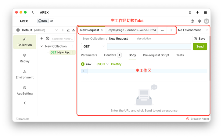
The main workspace is the core functional area of AREX, where users perform tasks such as API debugging, replaying recorded test cases, environment management, application configuration, and more. Due to the wide range of functionalities provided, users navigate through nonlinear workflows and often need to switch between multiple functional modules. To provide a good user experience and efficient operation, the main workspace in AREX utilizes the Tab component to organize and display different functional page modules.
Users can quickly switch to the desired functional page within the main workspace using Tabs. Additionally, Tabs cache the functional pages when switching, avoiding frequent reinitialization of the pages. This enhances the user experience and efficiency. This may seem like an obvious and straightforward feature, as the functionality of Tabs is already implemented in UI frameworks. However, during the actual implementation process, we encountered some challenges.
1.0 - Primitive conditional rendering
In the early versions of AREX, the Tabs component was implemented using the JSX concatenation syntax before Ant Design 4.23.0. The simplified code for the Tabs component is as follows:
 <Tabs
  activeKey={activePane}
  onEdit={handleTabsEdit}
  onChange={setActivePane}
>
  {panes.map((pane) => (
    <Tabs.TabPane
      key={pane.key}
      tab={genTabTitle(pane)}
    >
      {pane.paneType === PaneTypeEnum.Replay && (
        <Replay data={pane.data as ApplicationDataType} />
      )}
      {pane.paneType === PaneTypeEnum.ReplayCase && (
        <ReplayCase data={pane.data as PlanItemStatistics} />
      )}
    </Tabs.TabPane>
  ))}
</Tabs>
The "panes" in the main workspace are responsible for maintaining data such as the type, name, and initialization parameters of each functional page, and they are managed by the global state. When a new functional page is added or closed, it triggers an update operation on the panes.
The Tabs.TabPane component in the main workspace is implemented using conditional rendering. When iterating through the panes, it matches the corresponding page component based on the paneType property of pane and renders it. This implementation approach is simple and straightforward, as dynamic rendering of pages is achieved through conditional statements. However, this approach also has some drawbacks, such as reduced code readability and elegance due to a large number of conditional statements. Additionally, it lacks scalability, as adding a new functional page requires modifying the code in the Tabs component, violating the open-closed principle.
Therefore, to address these issues, we consider the need for a more generic implementation approach to accommodate future unknown functional pages.
2.0 - Dynamic Component Rendering
Due to the uncertainty of the actual component corresponding to TabPane in the Tabs component, which dynamically changes based on user actions, we came up with the idea of transforming TabPane from a conditional rendering component to a dynamic component. By using dynamic components, we can dynamically load and render functional pages based on configuration information, providing higher scalability and flexibility. With this approach, adding a new functional page only requires configuring the corresponding parameters, without the need to modify the code in the Tabs component. This greatly reduces the maintenance and extension costs. This improvement not only enhances code readability and elegance but also establishes a solid foundation for future feature expansions.
In front-end development, dynamic components are widely used to achieve highly flexible and reusable components, catering to the need for dynamically rendering components. The concept of dynamic components is based on the idea of component-based development, where the page is divided into independent and reusable units. By dynamically loading and rendering these components, we can achieve flexible page construction and interaction.
In the Vue framework, we can use the <component v-bind:is="componentName"></component> syntax to achieve dynamic components. Here, componentName can be a variable that dynamically specifies different component names as needed, enabling dynamic loading and rendering of components.
In the React framework, we can achieve dynamic components by declaring a component variable and using it as the JSX tag name. This approach allows us to choose different components to render at runtime as needed. Additionally, we can use the React.createElement() method to dynamically create and render components.
In the refactored version of AREX, upgraded to adapt to Ant Design 5.0, we used the second approach to implement dynamic components. We also utilized the new shorthand notation provided by Ant Design, using item for better performance and more convenient data organization. Below is a simplified code snippet of the optimized dynamic Tabs component:
// Panes.ts
const CommonPanes = {
   ReplayPane,
   ReplayCasePane,
};
const ExtraPanes = {}; // 对外暴露的扩展配置
const Panes = Object.assign(CommonPanes, ExtraPanes);
export default Panes

// Layout.tsx
const tabsItems = useMemo(
  () =>
       panes.map((pane) => {
       const Pane = Panes[pane.paneType];
       return {
         key: pane.key,
         label: genTabTitle(pane),
         children: <ErrorBoundary>{React.createElement(Pane, { data: pane })}</ErrorBoundary>,
      };
    }),
  [panes],
);

<Tabs
   items={tabsItems}
   activeKey={activePane}
   onEdit={handleTabsEdit}
   onChange={setActivePane}
/>
In this approach, we extract the mapping logic between the types of functionality pages and their corresponding components from the Tabs component and place it in a separate file. The advantage of doing this is that it separates the responsibilities of the Tabs component, allowing it to not be concerned with the specific registered functionality page components. It also facilitates the expansion of functionality pages.
In addition to the mentioned details, there are two more aspects worth noting. Firstly, in the Panes.ts file, an ExtraPanes object is defined to expose configuration options for extending components. This provides a dedicated configuration space for secondary developers working on the project, ensuring isolation between their custom code and the source code. It helps prevent code conflicts when synchronizing modifications with the source code. Such configuration space isolation is also reflected in multiple aspects of AREX's design.
Secondly, an ErrorBoundary component is used to wrap the dynamic components. This is done to capture rendering failures caused by an invalid paneType and handle errors within the dynamic components. By using an ErrorBoundary, the entire page is protected from crashing due to errors in dynamic components. It provides a graceful way to handle and recover from errors, improving the overall stability and user experience of the application.
3.0 - Component Registration Management
In the previous solution, we have provided a dedicated configuration object to address the extensibility issue of dynamic components. However, limitations still exist, and we aim to provide a more universal and flexible component registration management solution to overcome the restriction of configuring functional components only within the ExtraPanes of the Panes.ts file.
This issue becomes particularly important during the AREX monorepo refactoring process. In the monorepo version, AREX is split into the arex-core shared pure function component package and the arex business logic package. The Tabs component responsible for rendering the main workspace is encapsulated in the arex-core package, while the mapping configuration Panes required for iterating through tabsItems is defined in both packages. The centralized configuration approach is no longer sufficient, and we need a distributed and multi-phase component registration management solution.
To solve this problem, we designed the ArexPanesManager container to manage the registration and fetching of functional page components, with the following simplified code:
export class ArexPaneManager {
  private static panesMap: Map<string, ArexPane> = (() => {
    const map = new Map<string, ArexPane>();
    for (const pane in ArexPanes) {
      map.set(pane, ArexPanes[pane]);
    }
    return map;
  })();

  public static getPanesMap(): Map<string, ArexPane> {
    return this.panesMap;
  }

  public static registerPanes(panesMap: {[key: string]: ArexPane }) {
    for (const name in panesMap) {
      const pane = panesMap[name];
      if (this.panesMap.has(pane.type)) continue;
      this.panesMap.set(pane.type, pane);
    }
  }

  public static getPaneByType<T extends PanesData>(type?: string): ArexPane<T> | undefined {
    return (
      this.panesMap.get(type || ArexPanesType.PANE_NOT_FOUND) ||
      ArexPanes[ArexPanesType.PANE_NOT_FOUND]
    );
  }
}
By utilizing the ArexPaneManager.registerPanes() method provided by the container, it is possible to register feature page components separately in different packages. Ultimately, the Tabs component in the arex-core package can use the ArexPaneManager.getPaneByType() method to obtain the complete mapping configuration of feature page components.
It is worth mentioning that, in order to standardize all feature page components under the Tabs in the main workspace, we have designed the ArexPane type as a standard. All feature page components that appear under Tabs should inherit from this type. To achieve this, we provide the ArexPaneFC type and the createArexPane() method. All page feature components are first defined by ArexPaneFC, and then wrapped by the createArexPane() method to obtain ArexPane feature page components that can be registered and managed by the ArexPaneManager. The related type definitions and method simplification code are as follows:
export type Pane<D extends PanesData = PanesData> = {
    id: string;
    key?: string;
    type: string;
    data?: D;
};

export type ArexPaneOptions = {
    icon?: React.ReactNode;
    type: string;
};

export type PanesData = any;

export type ArexPane<D extends PanesData = PanesData> = ArexPaneFC<D> & ArexPaneOptions;

export type ArexPaneFC<D extends PanesData = PanesData> = React.FC<{ data: D }>;

export function createArexPane<D extends PanesData>(
  Pane: ArexPaneFC<D>,
  options: ArexPaneOptions,
): ArexPane<D> {
  const { noPadding = false } = options;
  return Object.assign(Pane, { ...options, noPadding });
}
Through three iterations, we have finally achieved a universal and distributed solution for registering and managing feature page components. This solution has been applied in the AREX monorepo refactoring and provides more possibilities and convenience for AREX's customization and development. Encapsulation and extensibility are important factors to consider during the development process, and we have been contemplating how to improve them in AREX. Our goal is to provide a better development experience for customizing AREX and extending its functionality.